Bar Chart/Frequency Table
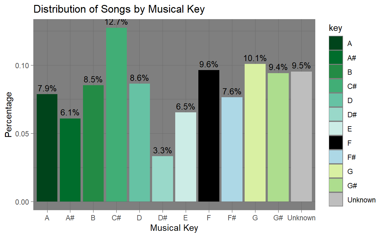
The key variable represents the musical key (e.g., A, B, C#, etc.) of each track. The bar plot displays the frequency count of each musical key. Proportions are shown below the plot, indicating the relative frequency of each key as a decimal and percentage. C# is the most common key in the dataset, appearing in about 12.6% of tracks. It is followed closely by the G (10.1%), F (9.6%), and the Unknown key (9.5%) key. These keys may be popular in mainstream music due to their harmonic flexibility or genre relations. D# is the least common key with only about 3.3% of tracks. Other less common keys include A# (6.1%) and E (6.5%). This may be due to difficulty in playing or less frequent usage in popular music genres. Overall, while some variation exists, the keys are reasonably well-distributed across the data set. No key(other than D#) appears to be an extreme outlier in frequency.
#Stacked bar charts
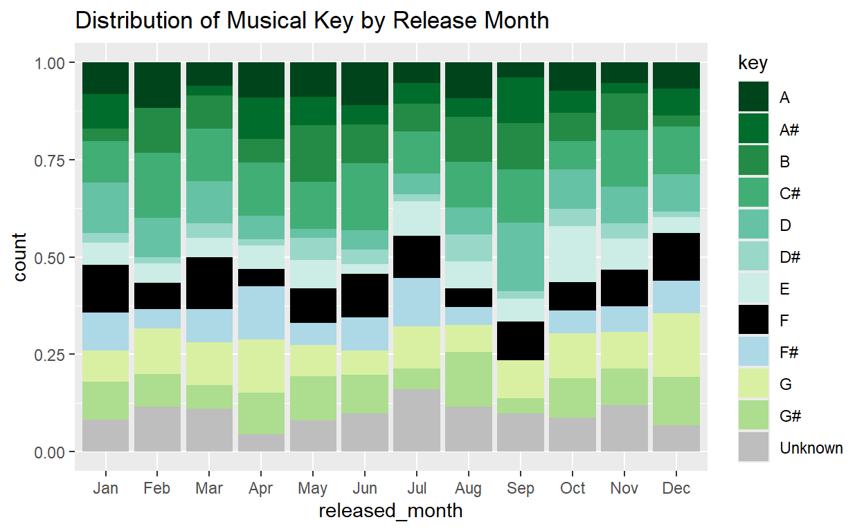
When looking at this stacked mosaic bar charts there are a few things to note on how a songs key relates to the month. Firstly, the key popularity is mostly consistent across months.There is a consistent green section (representing keys like A, A#, B, C#, etc.) dominating the chart in every month. These keys are more frequently released compared to others. Keys A, A#, B, C# are consistently high across months indicating that they are either more commercially successful or more genre-flexible. There are also slight monthly variations in the distribution like July and September show a larger share for F. April or August being more balanced across more keys.
#Box Plot
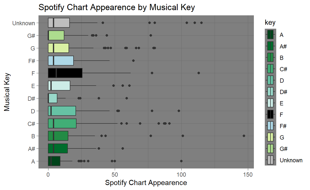
All keys display a generally right-skewed distribution, with many songs clustered at lower chart apparence.Most musical keys have chart appearances heavily concentrated near lower values. The median for almost all keys is low, suggesting that most songs in each key don’t appear frequently in the charts. Nearly every key has outliers, shown as dots to the right of the boxes. These indicate tracks in that key that charted significantly worse than the others. Keys like D, C#, and G have more significant chart representation, indicated by more frequent outliers while Some keys (A#, B, D#) show more clustered points, implying their songs tend to have more predictable performance in the charts.From this we can infer that key choice matters where certain keys appear to have a higher likelihood of charting multiple times (G, F, C#), while others are more stable but less frequently chart-topping (D#, A#).
Density Plot
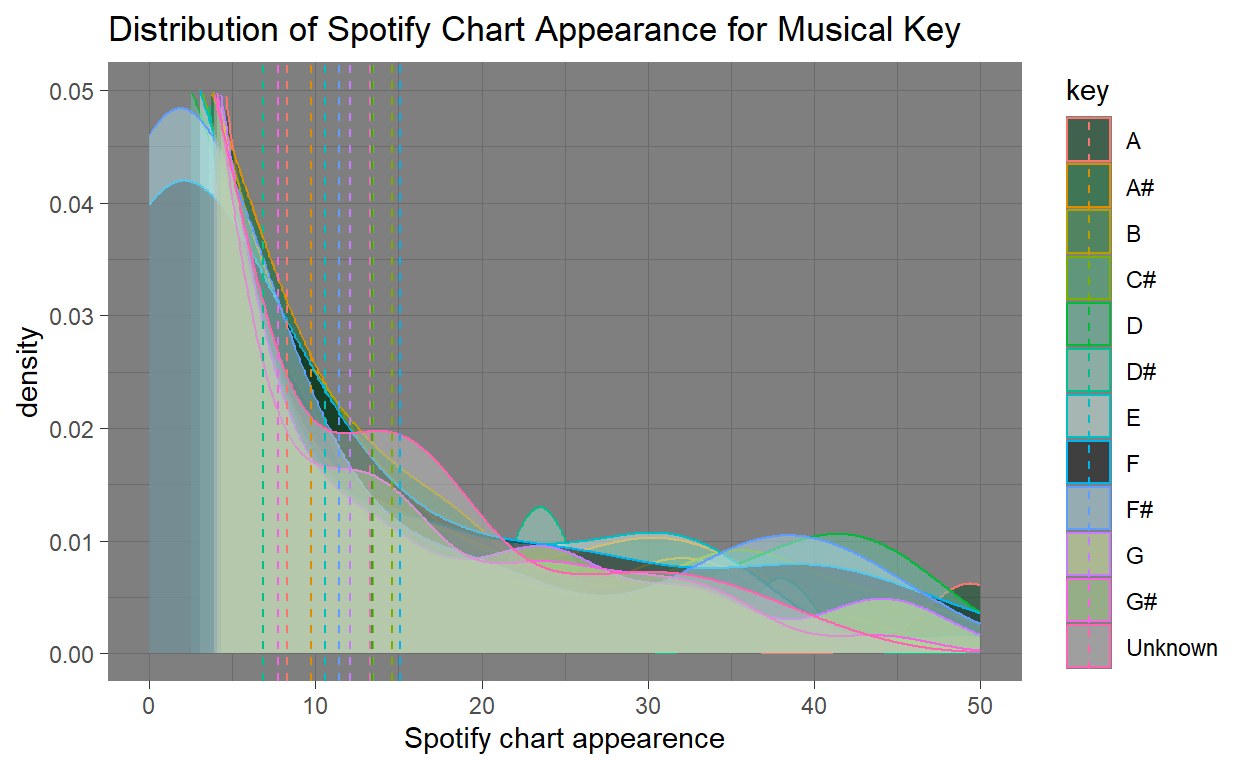
When looking at the density plot for Spotify chart appearance,The distribution is heavily right-skewed since most of the density is near 0 indicating that the majority of songs do not get substantial chart play, regardless of their key. Additionally all keys have similar mean values suggesting that chart performance is not significantly influenced by musical key alone. No single key appears to dominate in terms of higher mean appearances. With this we can infer that there is no musical key that significantly stands out in terms of average Spotify chart appearances.
Hexbin Plot
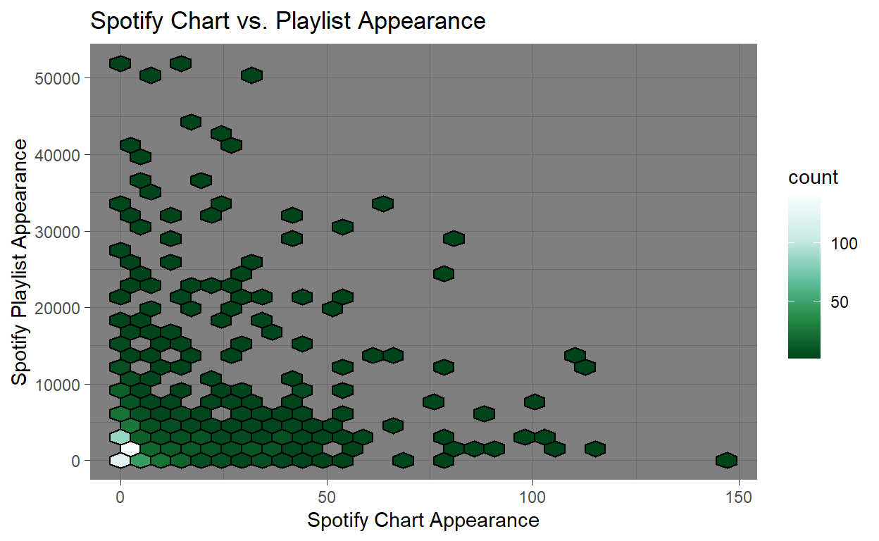
This plot shows a hexbin plot, which visualizes the density of data points in two dimensions. The x-axis represents a tracks appearance in Spotify charts while the y-axis shows how many times a track is included in Spottily playlists. The color intensity represents the count of points in each hexagon, with darker colors indicating higher density. With this in mind we can see the most data points are clustered around the high ranking tracks for Spotify charts and playlists. This suggests many tracks appear in a few charts and are included in only a few playlists.
Interactive Scatter Plot
Building off of the Hexbin plot, this interactive scatter plot aims to demonstrate the relationship of how each individual musical key correlates to Spotify Chart Appearance and Spotify Playlist Appearance.When analyzing each individual key, the most major take away is that each key shows a very weak linear correlation as the two keys with the highest correlation value (D and E) and yield a value of about 0.3.
Conclusion:
The analysis of musical keys in relation to Spotify chart appearances and playlist inclusions provides intriguing insights into how key selection may influence a track’s success. While certain keys, such as C#, G, and F, show higher frequencies in chart appearances, the overall distribution across months remains relatively consistent. This suggests that these keys are either more flexible across genres or more commercially favored for mainstream music. In contrast, keys like D#, A#, and E are less common, potentially due to their structural complexity or niche genre associations. From the mosaic plot analysis, it’s evident that the key distribution does not significantly change across release months. Popular keys maintain their presence year-round, with some minor variations. The hexbin analysis reveals that while many tracks appear in both Spotify charts and playlists, the majority only do so a few times. A large concentration of tracks achieves low visibility, indicating that simply choosing a common key is not enough for breakout success.The density plots further confirm that chart appearances are heavily right-skewed across all keys, with most tracks achieving only minimal visibility. All in all, There is little evidence to suggest that any particular key has a strong influence on average chart performance. This is further supported by the weak linear correlations observed in the scatter plots, where even the most significant key correlations (D and E) only reached values of about 0.3.